Statera
Command Center
From passive reporting to active intelligence
for high-velocity ad campaigns
Outline
Ad-Ops managers couldn't detect campaign anomalies before significant budget loss. We set out to transform Statera from a retrospective reporting tool into an active command center, giving teams the intelligence to act before damage was done.
How might we surface campaign anomalies in real time and guide Ad-Ops managers toward the right action, before budget is wasted?
Journey to problem statement
What started as a routine quarterly business review led us to closely examine the escalation ticket patterns across the Ad-Tech operations domain.
Problem identification methods
Platform usage analytics
6 months of interaction data across 120+ accounts
Ad-Ops manager shadowing
Embedded with 8 teams during live campaign launches
Support ticket analysis
2,400+ tickets analyzed for delayed discovery patterns
Competitive benchmarking
Studied Datadog (severity-based alert triage), Bloomberg Terminal (information density at speed), and PagerDuty (actionable escalation flows)
Findings
"By the time I see the problem in my weekly review, I've already burned through $15K in wasted spend."
Senior Media Buyer, E-commerce Brand
"The dashboard shows me beautiful charts, but I need it to scream at me when something's wrong."
Performance Marketing Director, SaaS Company
- Ad-Ops workflows are reactive, not proactive. Users logged in 2.1x/day. Critical mid-day issues went unnoticed.
- Context switching kills efficiency. Managers toggled between 5 platforms 47 times per session.
- No prioritization framework. All campaigns presented equally. Which one needs attention RIGHT NOW?
Statera's data pipeline operated on a 4-hour batch processing cycle. For high-velocity campaigns running $500+/hour budgets:
- A campaign could hemorrhage $2,000 in 4 hours before appearing in the dashboard
- All analysis happened client-side, so users manually filtered and interpreted data with no intelligence layer
From report generator
to mission control
for ad spend.
Core design principles
Alert Before It Hurts
Surface anomalies as they happen, not hours later.
Context Over Raw Numbers
Every metric needs a comparison point: vs yesterday, vs target, vs threshold.
Reduce to Next Action
Don't make users figure out what to do. Suggest the action.
Visual Health Scoring
Status badges (LOSING, SCALING, PROFITABLE) replace ambiguous states.
Eliminate Platform Hopping
Embed controls directly in the interface.
Dashboard evolution
- Single metric card, no alerts
- Generic chart with dips and spikes that demand manual investigation
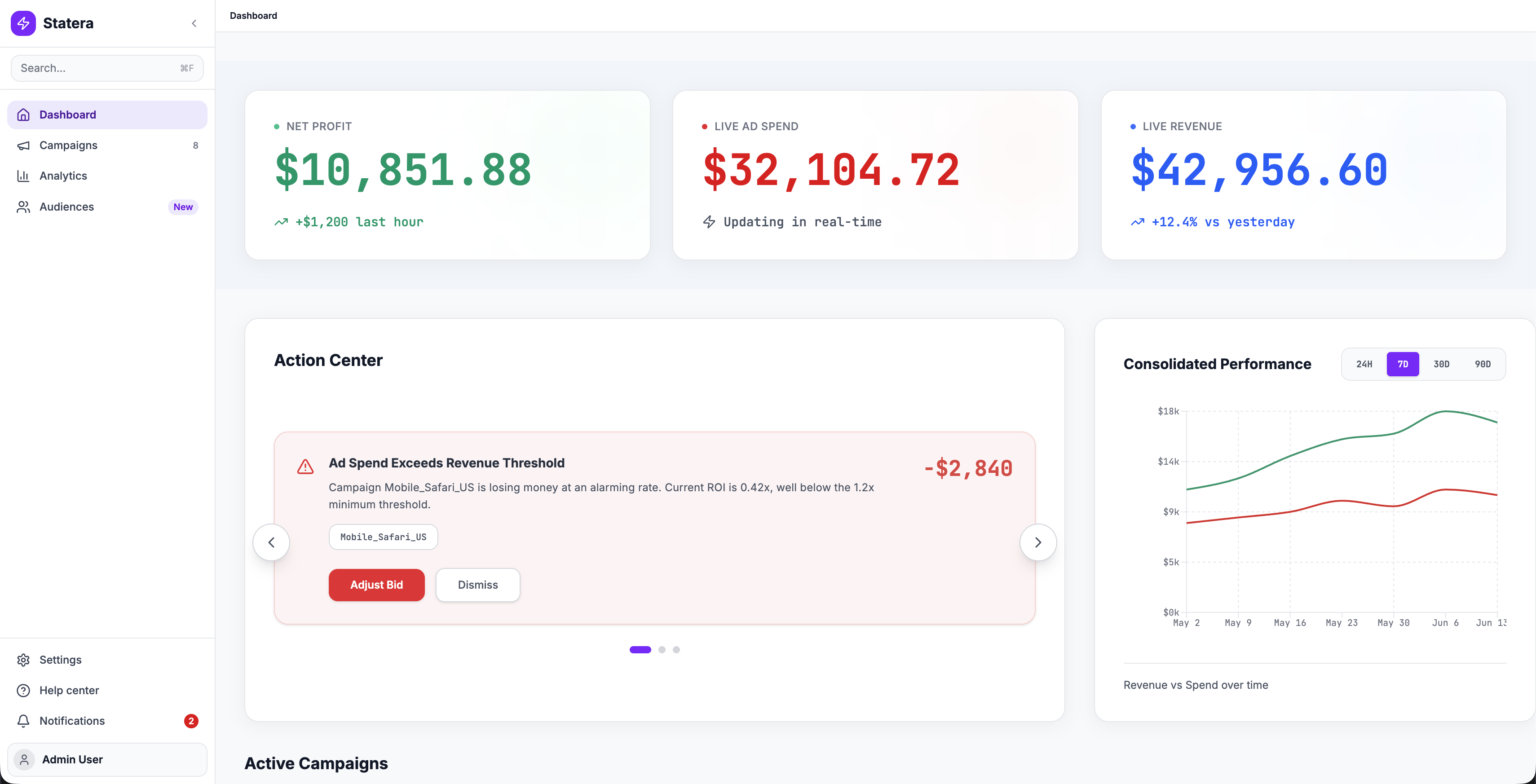
- Three hero metrics with real-time deltas
- Action Center surfaces problems proactively
Prioritized campaign management
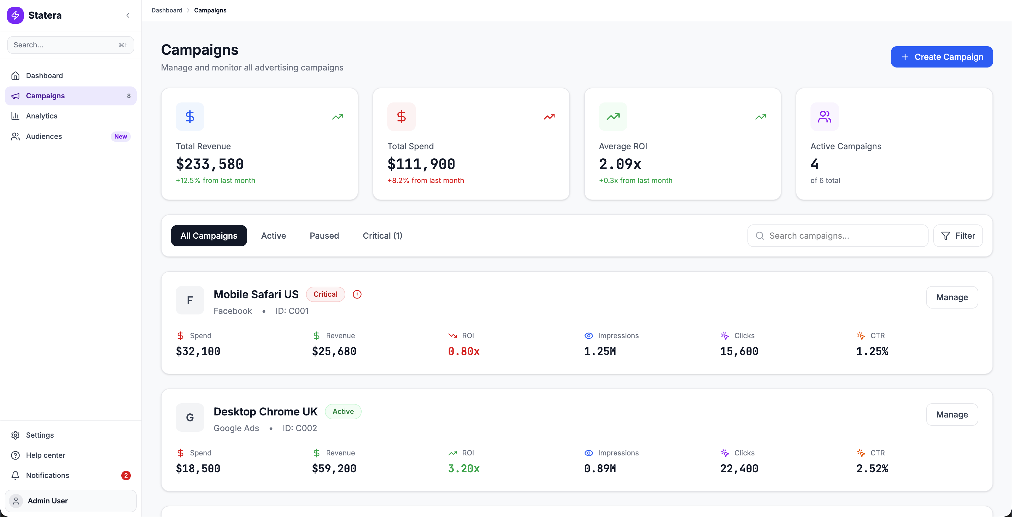 Campaigns Command
Top-level KPI cards, smart filtering with automatic triage (Critical tab), and campaign cards with visual health scoring (LOSING, SCALING, PROFITABLE) replace the flat table.
Integrated campaign builder
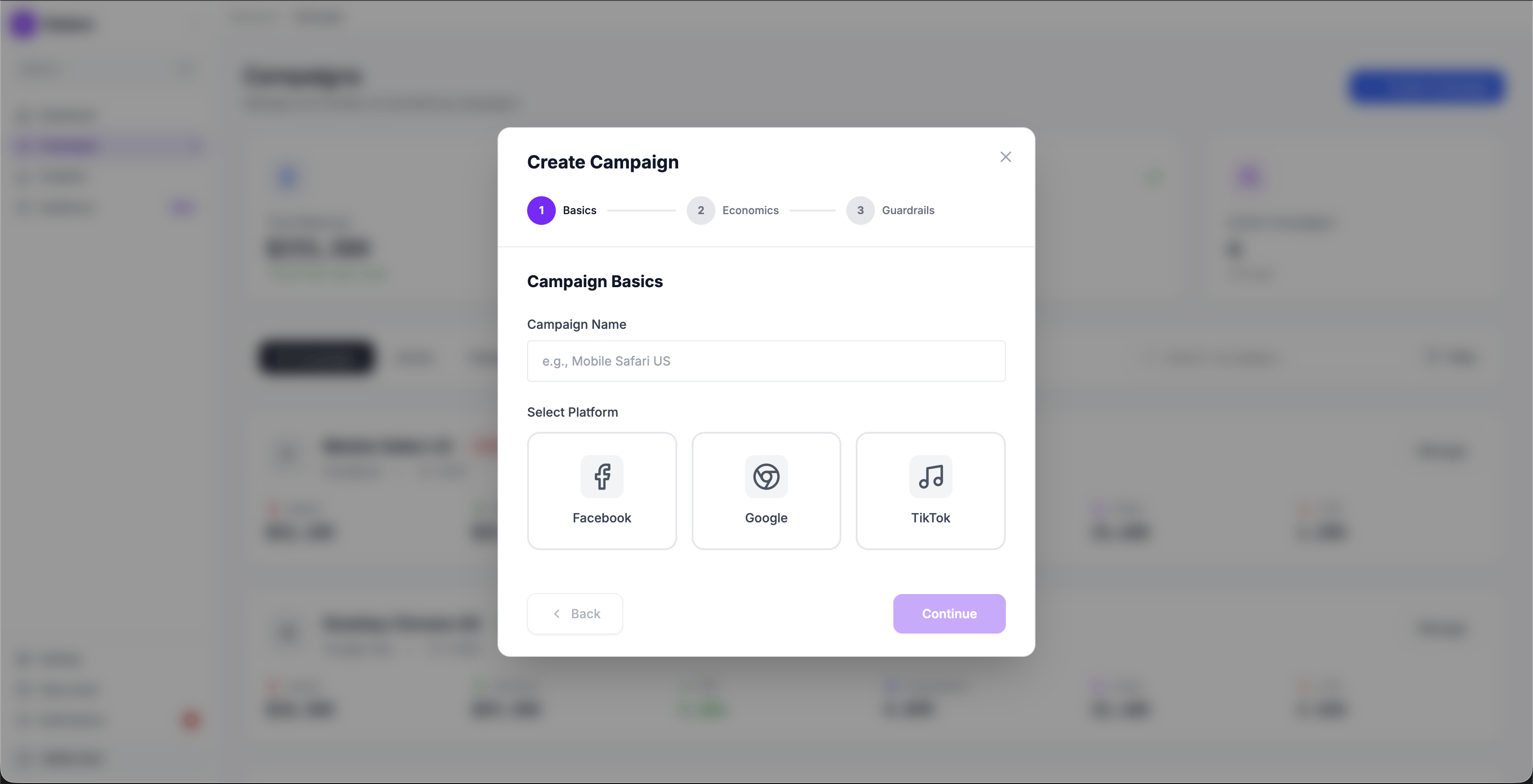 Campaign Wizard
Early testing with a single-page form showed users skipping the guardrails fields (they felt optional). Breaking the flow into 3 explicit steps (Basics, Economics, Guardrails) made each stage feel intentional. Users couldn't accidentally skip the safety net.
Basics
Campaign Name + Platform Selection (Facebook, Google, TikTok)
Economics
Budget allocation, Target ROI thresholds, Auto-pause triggers
Guardrails
Min/max ROI bounds, Daily spend limits, Performance alerts
It's like Statera went from showing me a mapAd-Ops Manager, Post-Launch Interview
to being my co-pilot.
What happened
The redesigned command center was validated through usability testing with Ad-Ops teams and received strong qualitative feedback. However, the company made a strategic decision to sunset Statera before the redesign reached production.
This is the reality of product design: not every well-designed solution ships. The business context shifted, and the project was deprioritized in favor of other initiatives.
What we validated
In testing, users shifted from reactive weekly reviews to proactive monitoring when anomalies were surfaced immediately.
LOSING / SCALING / PROFITABLE badges let users triage campaigns at a glance instead of interpreting raw numbers.
Users completed campaign adjustments within Statera instead of context-switching across 5 platforms.
Constraints & trade-offs
4-hour data lag couldn't be fully eliminated
Engineering could reduce the batch cycle to 30 minutes, but true real-time streaming required infrastructure investment the business wasn't ready for. We designed the alert system to work within the 30-minute window and clearly communicated data freshness to users.
Health scoring thresholds were debated
What counts as "LOSING" vs "PROFITABLE" varies by industry and campaign type. We defaulted to ROI-based thresholds but designed the system to let power users customize their own, a scope addition the PM initially pushed back on.
Campaign creation was descoped from V1
The integrated campaign wizard was designed but deprioritized for the initial release. The team decided to ship the monitoring and alerting experience first, since that addressed the core pain point.
What I took away
On the Design
Shadowing > Surveys
Watching an Ad-Ops manager manually calculate ROI in a spreadsheet, while sitting in front of our dashboard, was worth more than 50 survey responses. The gap between what users say they do and what they actually do is where the real problems hide.
Status labels are a design decision, not just UI
Choosing to label a campaign "LOSING" instead of showing a red number was a product decision as much as a design one. It required alignment with PM and stakeholders on what the platform should communicate and how directly.
On the Outcome
Good design doesn't guarantee survival
The project was sunset due to business priorities, not design quality. This taught me that understanding the business context (funding, market timing, strategic direction) matters as much as understanding the user.
What I'd push for earlier
I would have advocated for a smaller, shippable slice sooner, just the alert system without the full dashboard overhaul. A faster path to production might have demonstrated value before the business decision was made.